Brand
Typography
Lora is the primary typeface across
all branding. Lora is described as a well-balanced contemporary serif with
roots in calligraphy […] with moderate contrast well suited for body
text
. It was chosen because of its humanist qualities and readability.
The following variations are used:
- Regular (400);
- Regular italic (400); and
- Bold (700).
Colours
- background #FFFBF5
- background variant #EFECE1
- on-background #11081A
- on-background variant #2F1C41
- borders #11081A
- link #1378BF
- hovered link #49ACF2
- active link #D94436
- visited link #734C99
Dark theme
- background #1D1C1E
- background variant #302C34
- on-background #FFFBF5
- on-background variant #EFECE1
- borders #FFFBF5
- link #FFFFFF
- hovered link #49ACF2
- active link #D94436
- visited link #E0DCC5
Logo
There are four variations of logo:
- icon;
- logotype;
- icon and logotype; and
- sub branded icon and logotype.
Icon
The icon is a square containing a logo known as the "cut out" (e.g. the stylised "d" and "f").
The cut out can be changed in the sub branded icon and logotype variation. A custom cut out should be a simple silhouette.
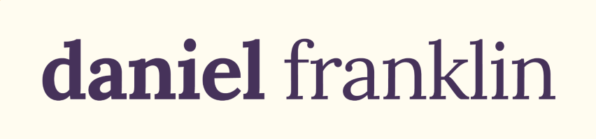
Logotype
The logotype is set in Lora, all lowercase, with a tracking of -20. The kerning between words (e.g. "daniel" and "franklin") is 220.
Icon and logotype
The icon is placed to the left of the logotype.
Sub branded icon and logotype
A subtitle is placed underneath the logotype, which is raised slightly higher to accommodate for the additional text.